After upgrading from 4.4 to 5.0, I found a couple of behaviors which appear to be design choices, but I wanted to confirm. Also, if they’re choices, I’d like to ask for the original behavior back.
First, all checkboxes for my custom fields are rendering as radio buttons. To put it another way, the squares are displaying as circles, which is supposed to indicate a situation described as “pick any one of these items, but they’re mutually exclusive items.” Squares are supposed to indicate a list of items that are not mutually exclusive, but rather a series of topically related items that are each yes/no or on/off in their own right despite being related. By making both of these categories (“pick any one” and “pick all that apply”) render with the same visual cue, the end user doesn’t have visual guidance on how to act.
The second thing I’ve noticed is with a list of “pick all that apply” items, but rendered as a list instead of checkboxes. I used to have a widget that behaved like a searchable pull-down menu, where each item selected added a “chicklet” to the list. Here is a visual example I grabbed off of Google Images:
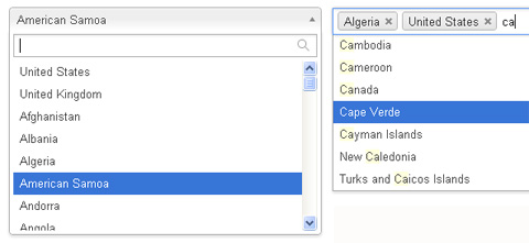
I don’t seem to have that option any more. Instead, the closest I could find was a scrolling list and my users have to hold down modifier keys when clicking on additional options in order to select several.
For example, MacOS users can click on the first item in the list and then hold down the Command (a.k.a. “Apple”) key while clicking on additional items. This is prone to accidentally losing the list of things you’ve selected by forgetting to hold the modifier key.
It also makes the list harder to use. For example, if we’re working on a ticket issue with a Window computer, the old method allowed us to type in “Windows” and then we’d see the “Windows Software”, “Windows Hardware”, and “Windows Other” options. We could also type in something like “Software” and see “Windows Software”, “Mac Software”, “iOS Software”, etc. This was very useful, since we wouldn’t have to remember the entire menu of dozens of options. A rough idea was enough to get us to the right phrasing and we would enter data more consistently than a free-form text field.
Is there any way to get those old behaviors back?